

A common question Livermore, Dublin, Mountain House, Pleasanton, San Ramon, and Tracy areahomeowners face with open floor plans or adjoining rooms is whether they should paint their living and dining rooms the same color. While using the same color can create a cohesive flow between spaces, homeowners can introduce different colors creatively without disrupting the overall harmony.
Choosing complementary shades or using accent walls enables homeowners to define each area while maintaining a balanced and unified look throughout the space.
The benefits of using the same color in adjoining rooms
Using the same color in adjoining rooms, such as a living and dining area, offers several design benefits that can enhance the overall look and feel of the space.
- Creating a cohesive flow: Using the same color in adjoining rooms, like the living and dining areas, creates a seamless transition, making the space feel unified and more open, potentially giving the illusion of a larger area.
- Simplified design: Sticking to one color simplifies decision-making, providing flexibility in selecting furniture, art, and accessories, as they can easily complement the consistent backdrop.
- Perfect for small spaces: In smaller spaces or open floor plans, using the same color helps avoid visual clutter and allows rooms to blend harmoniously, making the entire space look and feel more expansive.
Reasons to use different colors in living and dining rooms
- Defining each space: Using different colors helps to visually distinguish the living room from the dining room, especially in open-concept designs. This distinction can enhance the purpose of each space—relaxation in the living room versus formal or casual dining in the dining room.
- Adding personality: Varying the color schemes between rooms allows for more personalization, enabling homeowners to create unique atmospheres in each space that reflect different moods or themes.
- Complementary color schemes: Complementary colors can maintain harmony between the spaces while offering visual separation, such as using neutral tones in one room and bolder accents in the other for balance.
How to use different colors without clashing
To use different colors in adjoining rooms without clashing, consider these strategies:
- Stick to a consistent color palette: Choose colors from the same family to create cohesion. For example, selecting soft blues, warm neutrals, or earthy tones that are related in hue helps tie spaces together visually, even when the shades vary slightly.
- Pair light and dark shades of the same color: An easy way to achieve harmony is to use light and dark variations of the same color. For instance, a light grey living room can seamlessly flow into a dining room with charcoal walls, maintaining a cohesive look while offering contrast.
- Use accent walls or subtle contrasts: Introduce an accent wall in one room to bring focus without overwhelming. A bold color on one wall or using contrast in features like a fireplace or trim can create distinct spaces while linking them through shared elements.
- Transition with neutrals: Neutrals are ideal for bridging two spaces. Colors like beige, grey, or white act as a buffer, allowing one room to embrace a bold hue while the neutral keeps the adjoining space calm and balanced. This ensures bold choices feel intentional, not overpowering.
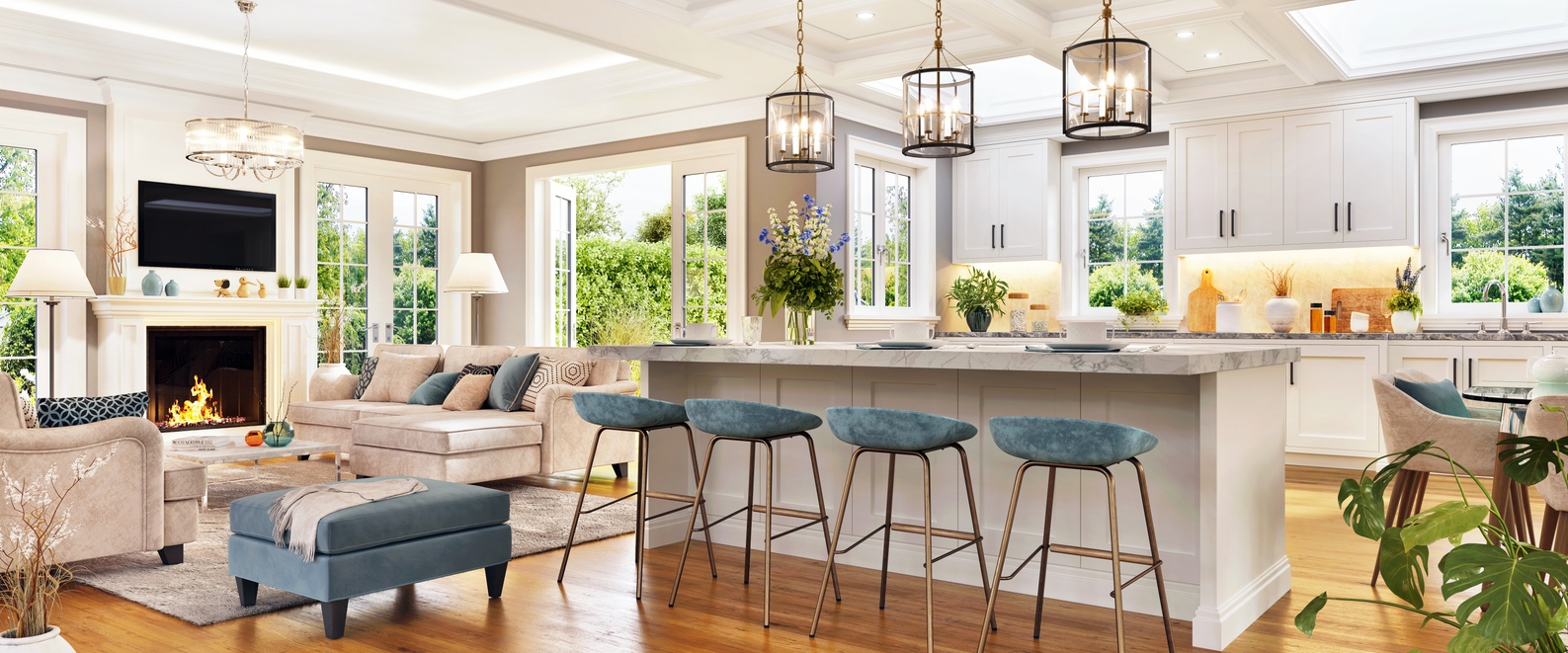
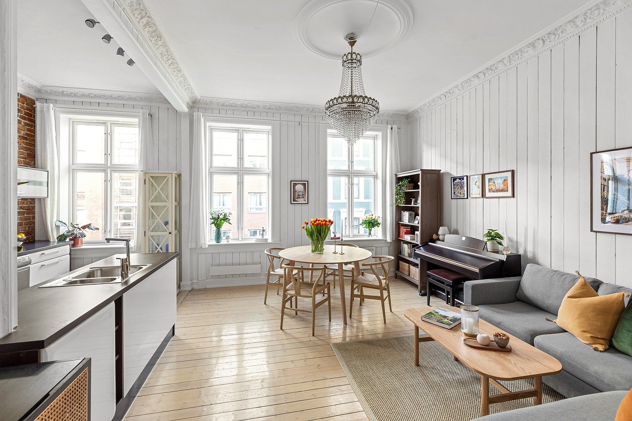
Open concept vs. separate spaces: Color considerations
A unified color scheme in open-concept spaces helps create visual harmony between living and dining areas. Using similar shades on walls can maintain continuity, but small variations in tone—such as lighter or darker accents—can subtly define distinct areas. Furniture, textiles, and decor offer an excellent opportunity to introduce contrast and add depth without overwhelming the space. For example, a soft gray or beige across both rooms, with richer tones in rugs, cushions, or accent chairs, helps delineate zones while preserving the open feel. You can also opt for faux paint finishes to provide contrast between teh rooms.
Defined spaces
For homes with partial walls, archways, or other architectural features that separate living and dining areas, you have more flexibility to introduce different colors while maintaining flow. Here, you can experiment with contrasting but complementary shades, such as a warm terracotta in the dining room and a soft taupe in the living room. Transitioning between spaces can be made cohesive through shared accent colors or decor elements that tie the rooms together. This approach adds visual interest and personality while respecting the room’s distinct functions.
Techniques for blending two colors
Here are three effective techniques for blending two colors in a space:
- Using an accent color: An accent color that appears in both rooms, such as on trim, furniture, or décor, can act as a “bridge” between different wall colors. It creates a sense of unity and consistency, allowing the separate spaces to feel connected. The accent color subtly harmonizes the overall design, making the transition between rooms smoother.
- Using furniture or rugs as connectors: Incorporating furniture, rugs, or artwork that feature elements of both color schemes helps blend the two palettes. These design elements visually tie the spaces together, providing cohesion without requiring the walls to match perfectly.
- Gradual color transitions: A gradient effect, where one color slowly transitions into another, provides an artistic and seamless flow between rooms. This technique helps differentiate spaces subtly while avoiding harsh or abrupt contrasts, creating a smooth, harmonious feel.
Tips for selecting colors for adjoining rooms
Here are some tips for selecting colors for adjoining rooms:
- Consider the light: Natural and artificial lighting can drastically affect how colors appear. Rooms with ample natural light might make colors appear brighter and more vivid, while artificial light can change a color’s tone (e.g., warm lighting can make colors appear more yellow or orange). Test paint samples in each room at different times of the day to see how the lighting influences the colors.
- Think about room function: The purpose of each room should guide color selection. For example, a living room is a social space, so warm and inviting colors like soft reds, oranges, or earthy tones may work well. In contrast, a dining room might benefit from more formal or serene shades like deep blues or elegant neutrals to create a sophisticated ambiance.
- Look at the home’s overall style: A home’s architectural style and interior design should influence your color choices. For a modern home, sleek, neutral colors with bold accents may align with the aesthetic, while a traditional home may call for classic tones like muted greens, warm beiges, or rich jewel tones to complement its character. Keeping a cohesive look ensures a smooth flow between adjoining spaces.
When to hire a professional painter
Complex color schemes
When dealing with complex color schemes in adjoining rooms, professional painters can be invaluable. They have the expertise to help homeowners select colors that harmonize well across multiple spaces while ensuring a homeowner’s desired mood or effect for each room.
Professionals can also provide guidance on how to balance bolder accent colors with neutral tones, avoiding color clashes or overwhelming combinations. Their experience with color theory and lighting variations helps ensure the palette works cohesively in natural and artificial light.
Ensuring flawless transitions
Professional painters excel at creating clean, seamless transitions between rooms, particularly in areas where colors meet or architectural elements (like trim or molding) are shared between spaces. They have the tools and techniques to achieve crisp, straight lines, ensuring no color bleeds into another.
This precision is crucial for maintaining a polished, cohesive look when different colors or finishes are used in adjoining spaces, avoiding the uneven edges that can detract from the overall design.
Parting words
Adjoining living and dining rooms don’t have to be the same color, but maintaining harmony and flow between the spaces is key. Homeowners should feel free to explore their creativity, whether they prefer a unified palette or want to experiment with complementary hues to define each area.
When they need professional assistance, consulting our team at Custom Painting, Inc. can help ensure the perfect balance and a polished finish for their living spaces. For homeowners living in the Livermore area, call Custom Painting, Inc. at 925-294-8062 for a free consultation and quote, or complete the Contact form.
